Responsive Design
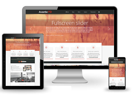
Desktop, Tablet, Phone, designed to look great in all sizes.
We've leveraged the responsive extension for the Bootstrap framework to ensure that this design will display appropriately in all devices.
Whether you're viewing it on a tablet, desktop or phone, the page will render this beautiful design -- sometimes hiding regions that are more glam and glitz than substance, for smartphone viewers.
Supported Views
With our adaptive responsive design, your site will adjust to tablets and phones displayed in portrait or landscape mode.
Adaptive vs Responsive
Technically speaking, Adaptive and Responsive are not entirely the same. Look it up in the dictionary and they're more or less synonyms. In the web design world, however, Adaptive means more "hiding/showing" of elements based on different screen resolutions, whereas Responsive means the resizing and moving of elements, gradually, based on screen resolution.
We use both techniques, together, to make your site respond in the best possible manner for whoever (or whatever) is viewing your pages. You don't need to know the mechanics of how it works, under the hood. But, if you want to expand on the use of this, you can check out the documentation at the Bootstrap website.